Mobile Trading App
Creating a brand new mobile experience from scratch to provide enhanced functionalities and features that enables users to monitor and execute trades on the run.
The Problem
The goal of this project was to redesign an existing native iOS mobile app from scratch. The existing app was created over 5 years ago and was only providing basic trade monitoring functions at the time. Also the UI was done when the brand identity was not fully established, so the design was outdated, unintuitive and inconsistent with our current UI.
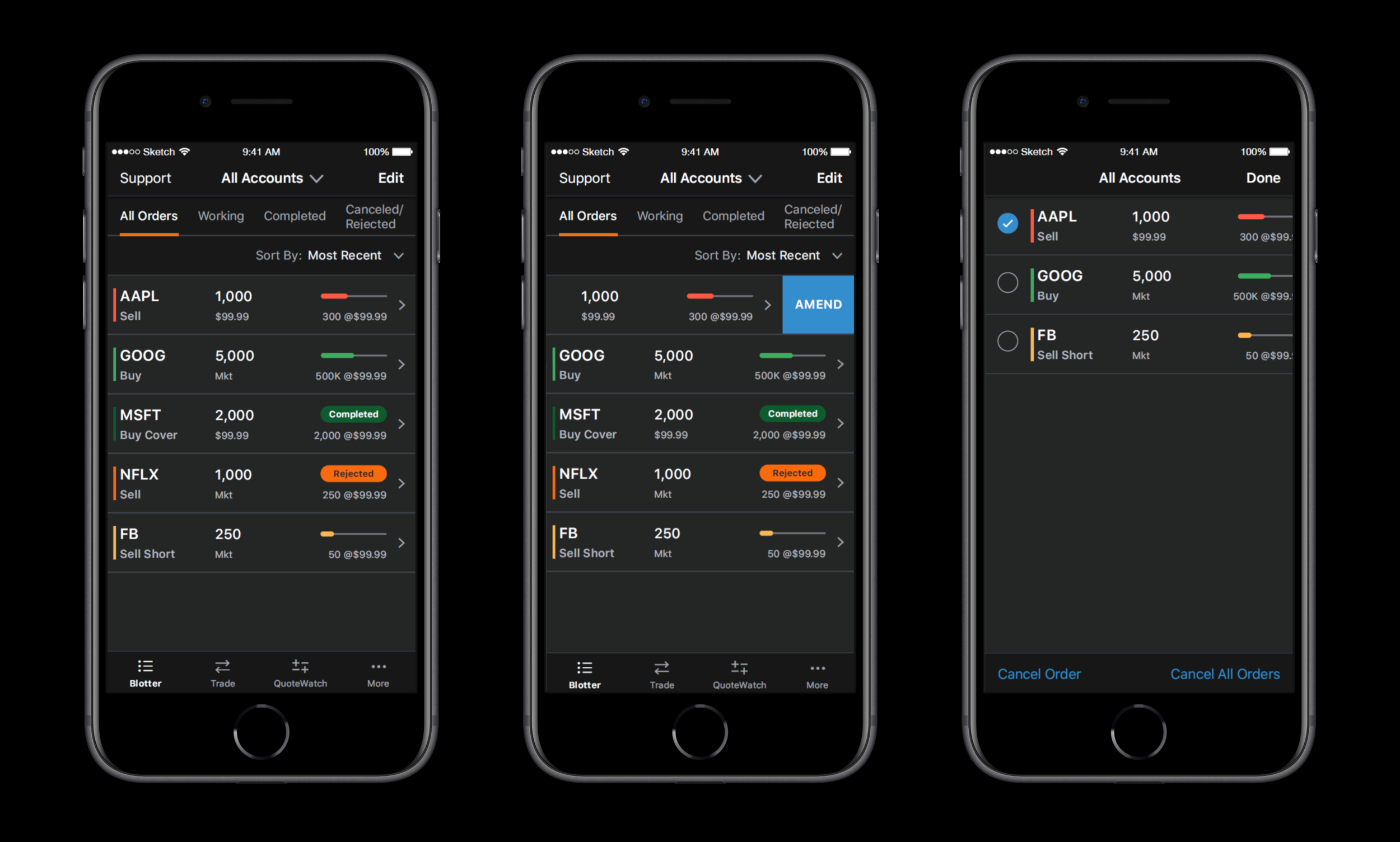
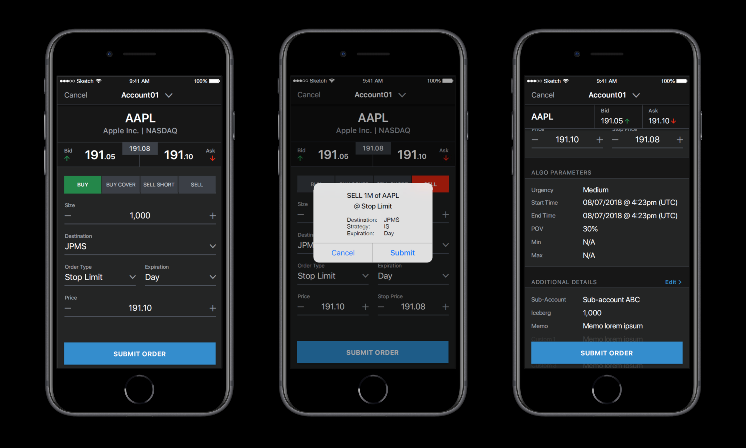
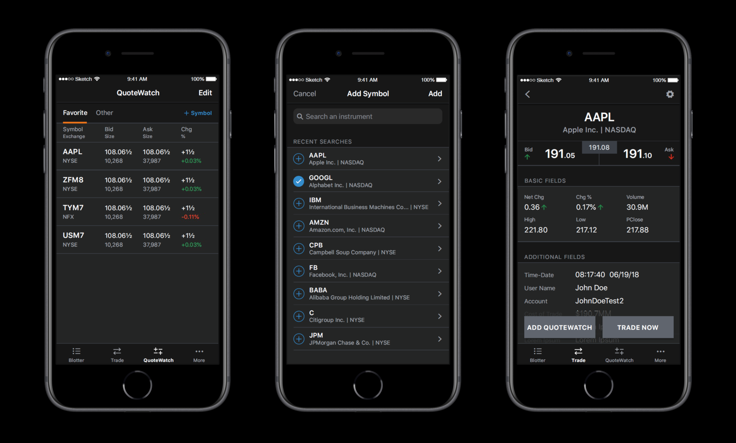
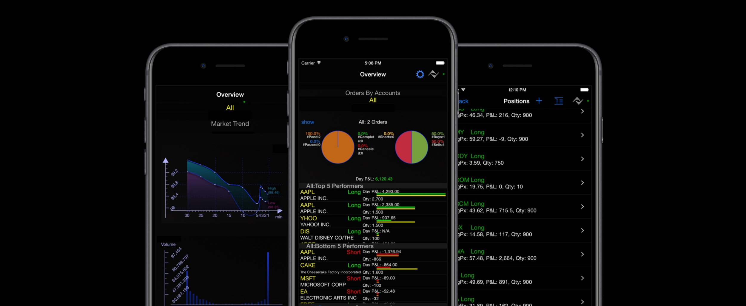
As our users shared their pain points of using the existing app and wanted to do more on the run, we’ve started looking into additional functions that would allow users monitor, submit and amend trade orders as well as manage and monitor their watchlists. The app was intended to serve as a companion application to the desktop app, not as an independent experience, so the interoperability in between the mobile and desktop apps were critical to integrate.
The challenge has been how to prioritize the requested amount of functionalities and features that users want within the given timeframe and reduce risk for MVP to release, test and iterate quickly.
Users & Audience
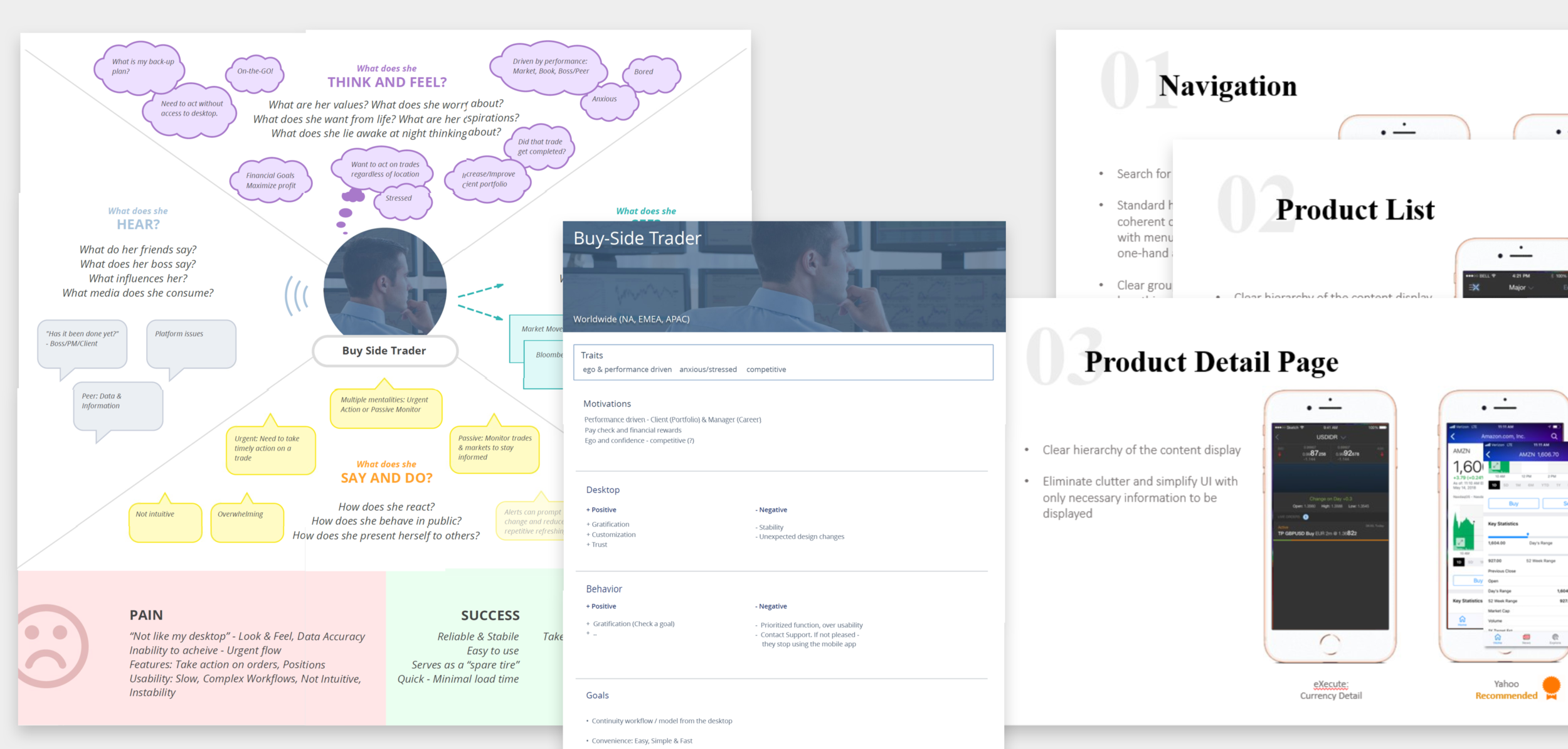
The target users of the app are the existing clients who are primarily traders. When we gathered our user personas, these users had a strong preference for mobile-first, fast, real-time experience so that they can execute trades quickly and monitor them while they’re still on the road.
Team & Role
Having had previous experience designing a native iOS app from the ground up, I co-led the team of 2 designers, partnering up with the product manager and developers.
I coordinated and led all facets of design with my team including: information architecture, user task flows, interaction, visual and quick prototyping. I also closely partnered and collaborated with the researchers to conduct user research using methods such as 1:1 interviews, surveys, focus groups, and participatory design in order to address both user behavior and attitudes.
Design Process
Mobile trading app project was a design-led project which presented a good opportunity to inject design thinking methodologies into every phase of the project. It was used as a successful example of incorporating design thinking within the organization while being conscious of time and costs.
Upfront Analysis
We started out with the market research to understand industry trends by conducting pattern benchmarking and aggregated industry best practices. We identified key specs that had to be included in the app in order to build the MVP and then mapped out key competitors by functionalities/screens to compare and focus on the best product output.
During our 3-day workshop to conduct a design thinking method, we utilized an empathy map to brainstorm ideas and features. Empathy maps acted as a great background for the construction of the personas that we created afterwards. It was a great visualization that we were able to create quickly to articulate what we know about our users and to draw out unexpected insights about our user’s needs such as the importance of watchlist and its interoperability in between mobile and desktop experience.
User Research
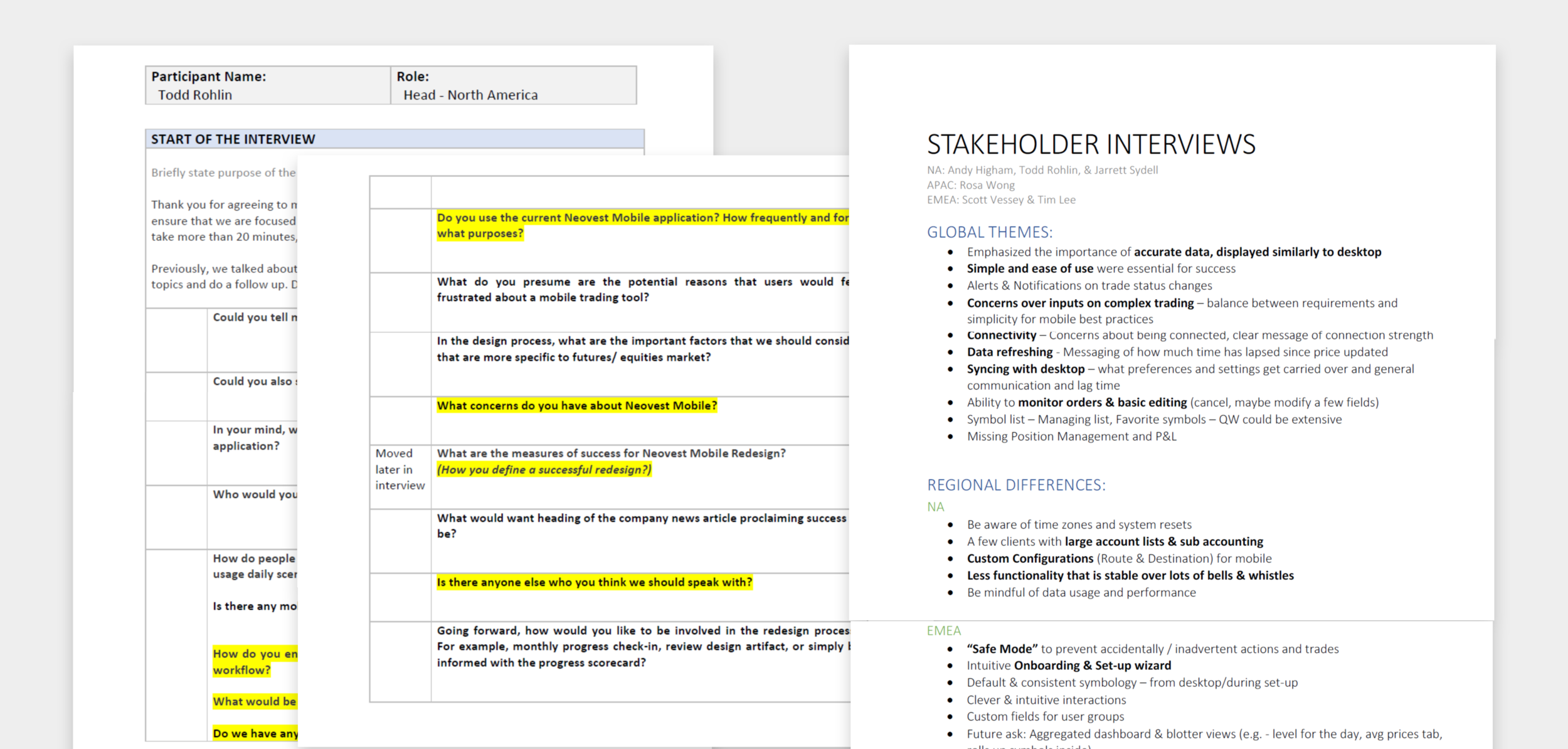
To understand our users and their needs, we conducted 1:1 stakeholder interviews first to gather insights from the business side and understand their pain points and goals and compiled regional specifications so we focus on first NA and EMEA users to test with particular group of users first and to prepare our plan on extending it to the APAC users in the future. We also met with potential and existing users to receive end-user inputs and demoed designs to them at every phase of the process from rough sketches, wireframes to quick prototypes and then to visual designs.
Google Design Sprint
To streamline our process and maximize the time with stakeholders, we facilitated an abbreviated 3-day workshop rather than Google’s 5-day process. We aligned cross-functional teams having design, tech, product and stakeholders all at the same table. We focused to mitigate future risk by solving the toughest problems collectively early in the process which helped us define our MVP requirements. Working together during the sprint, we were able to shortcut the endless-debate cycle and compressed our time and effort with increased participation and excitement across all project teams.
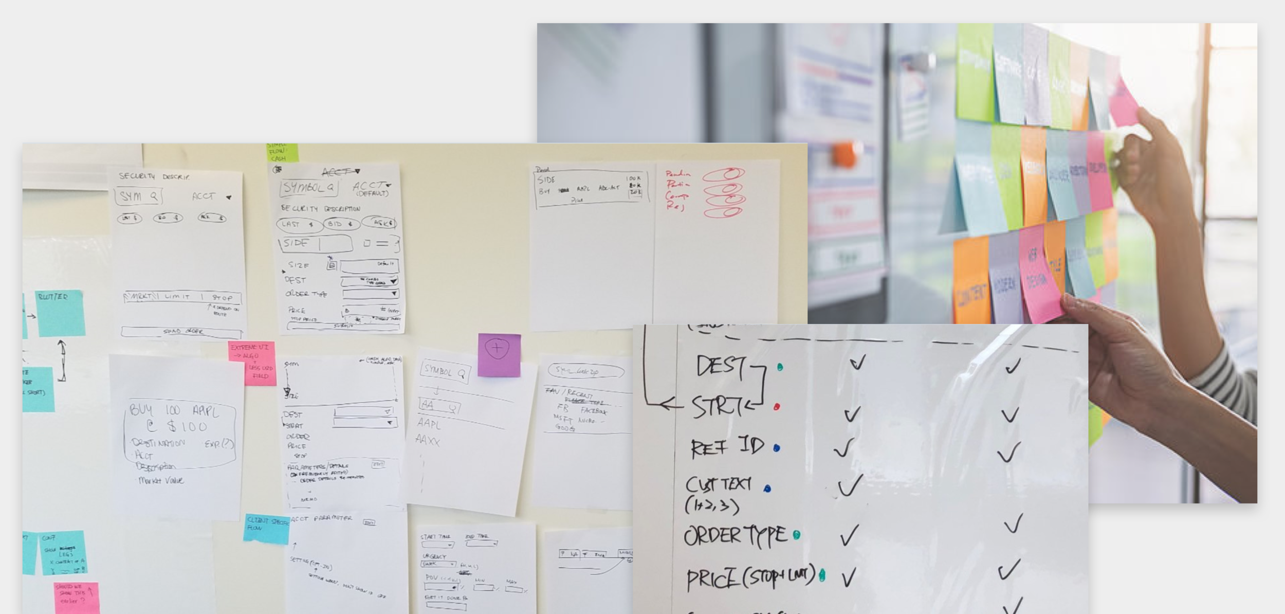
We identified the key specs that had to be included in the app in order to build the MVP, then mapped out user flows based on those specs (a lot of whiteboarding was involved). At this point in the process, we found participatory design to be extremely helpful. We had all of the team members participate in the design sprint workshop mapping out their ideal flows, which we were then able to incorporate into our design. We also engaged in Crazy 8 exercise as part of the process to quickly ideate ideas to generate a wide variety of solutions to our challenges.
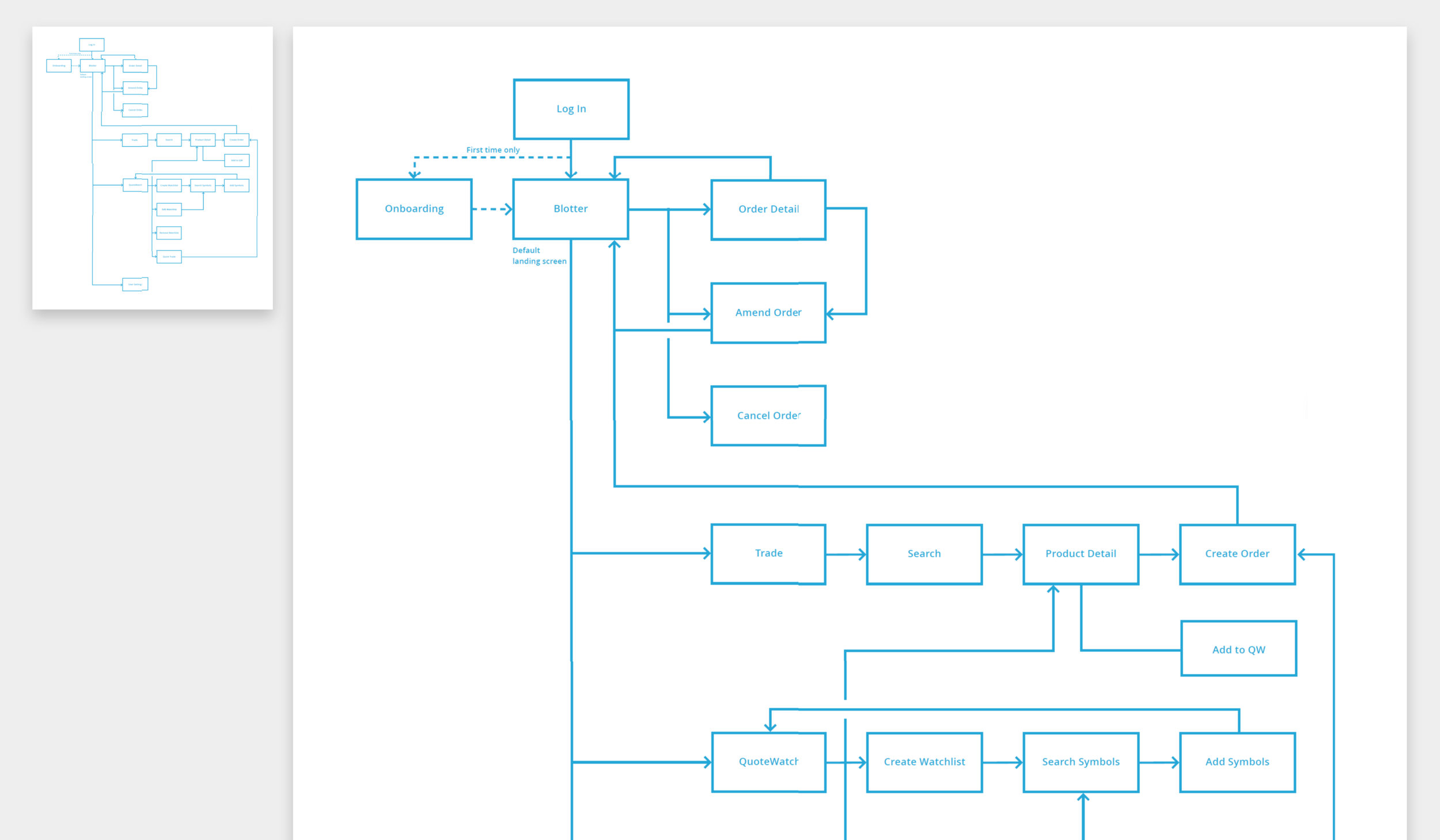
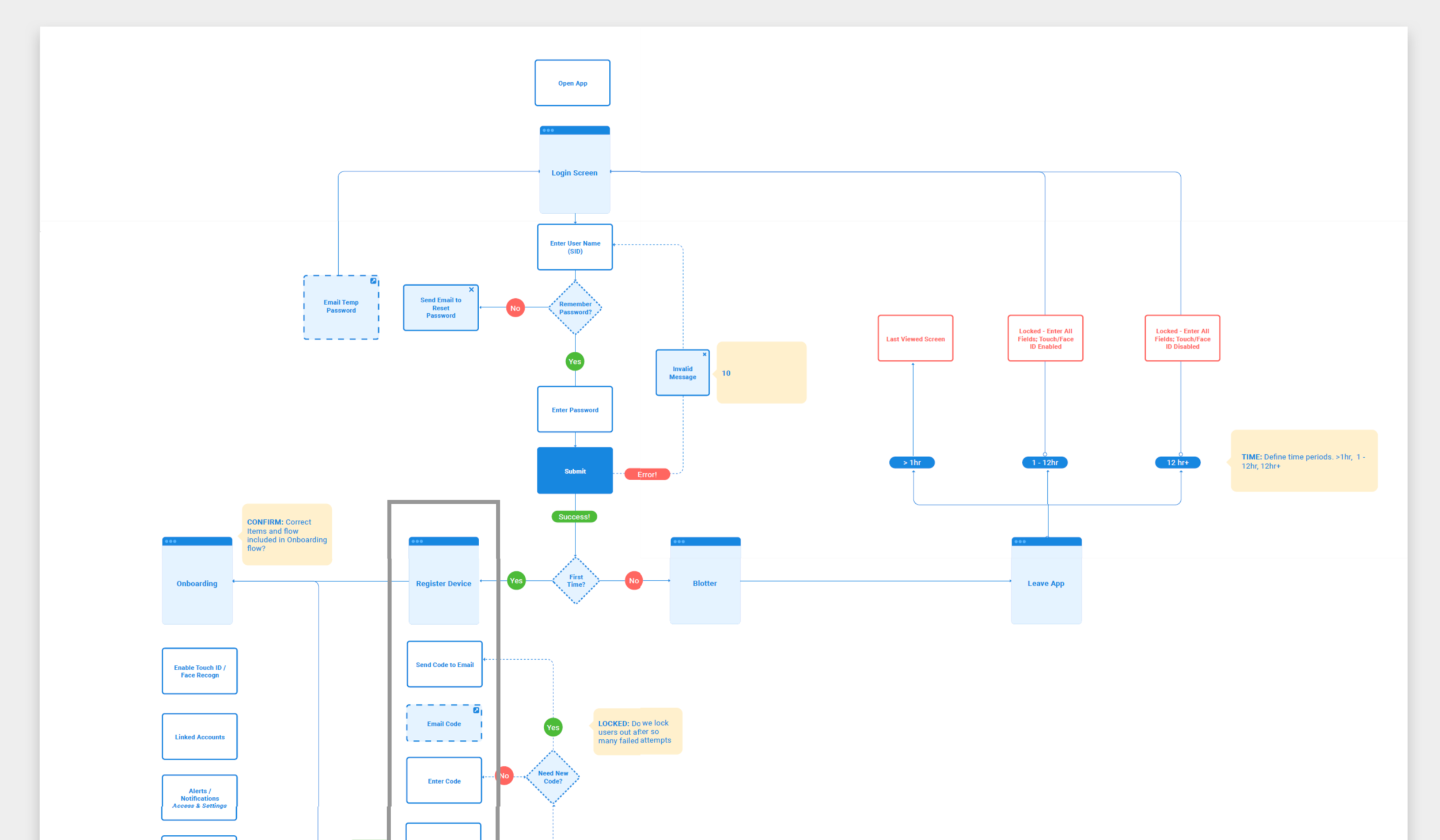
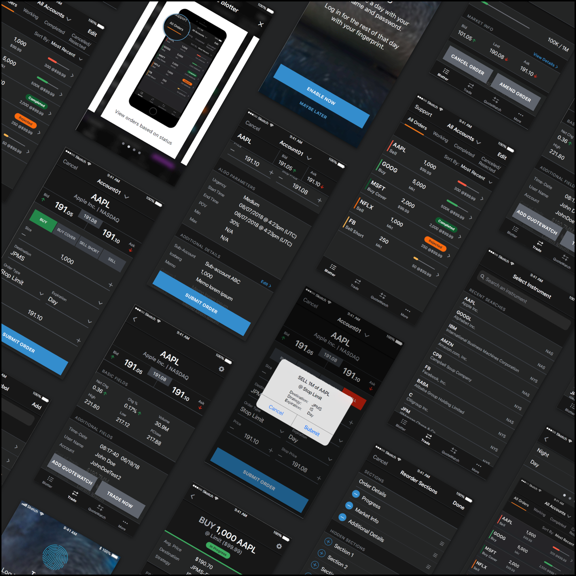
Based on the user flows, we constructed the information architecture to map out the screens and flows in detail and created a simple, clickable prototype to demonstrate the overall structure of each screens and interaction flows in between each other to quickly test and iterate before getting into the visual designs.
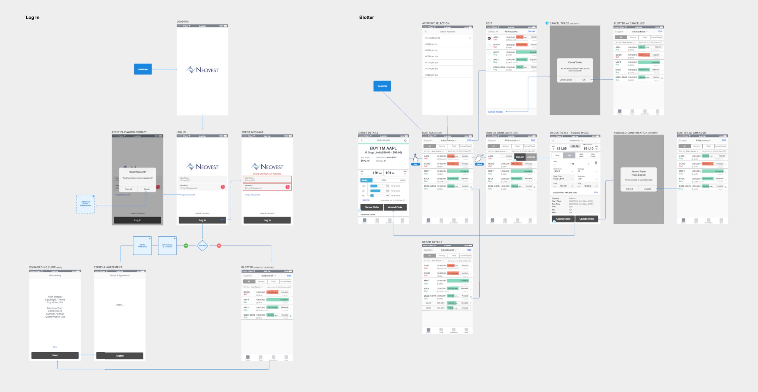
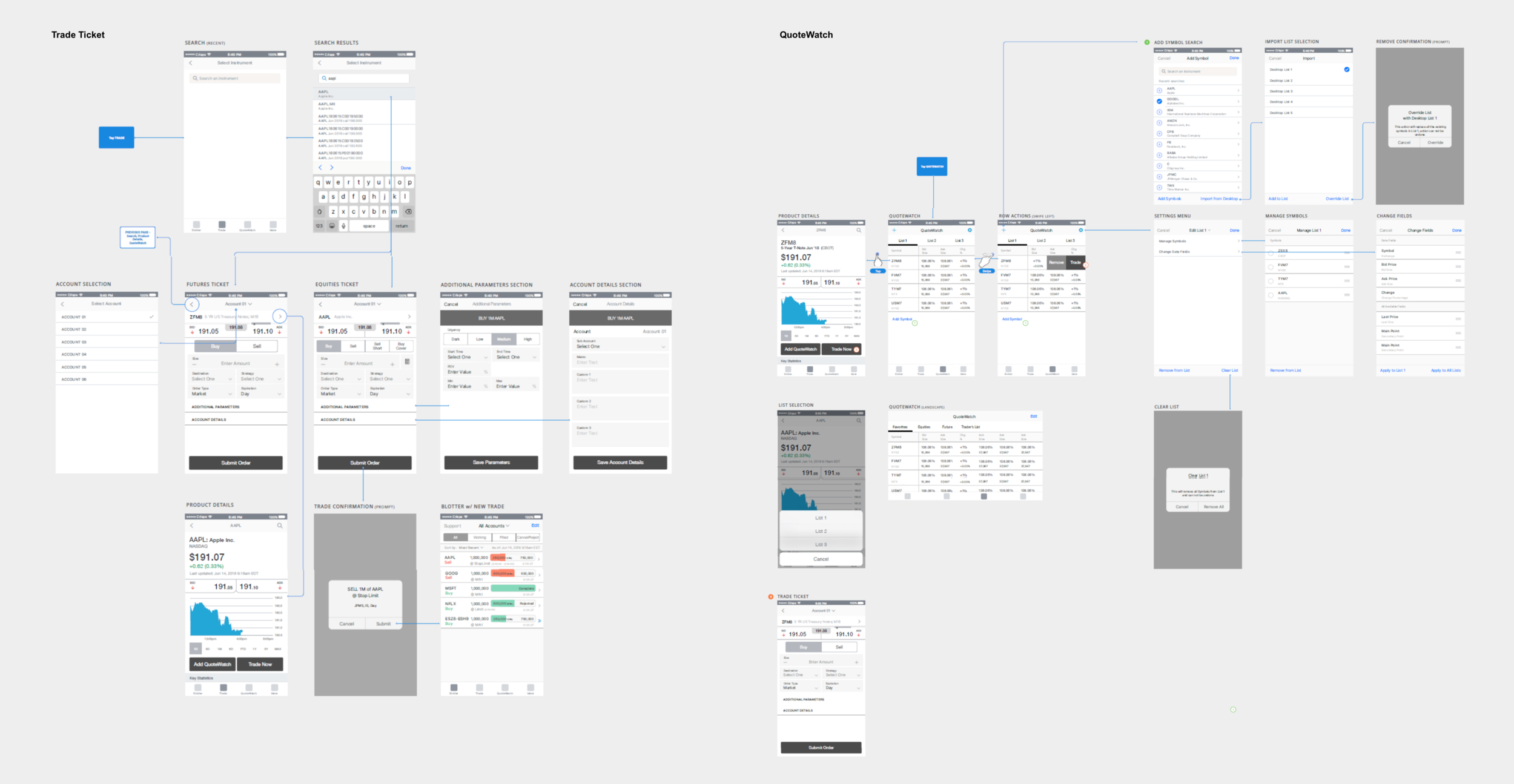
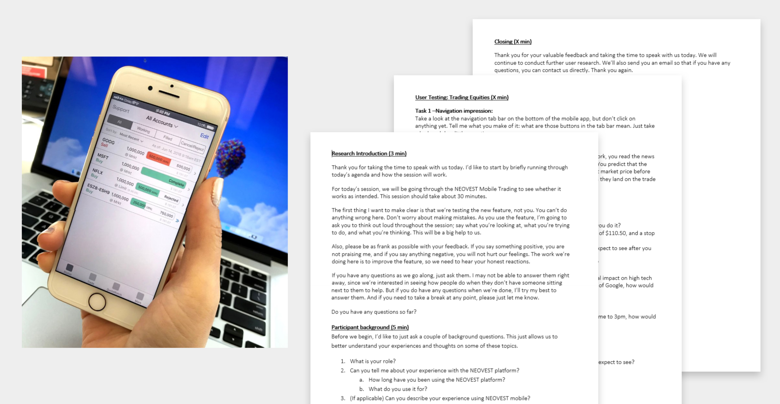
We’ve also conducted heuristic analysis facilitating a quick user-testing with clickable prototypes during the process to make sure we not only test the requirements and UX flows but also ensuring the overall usability aspect.
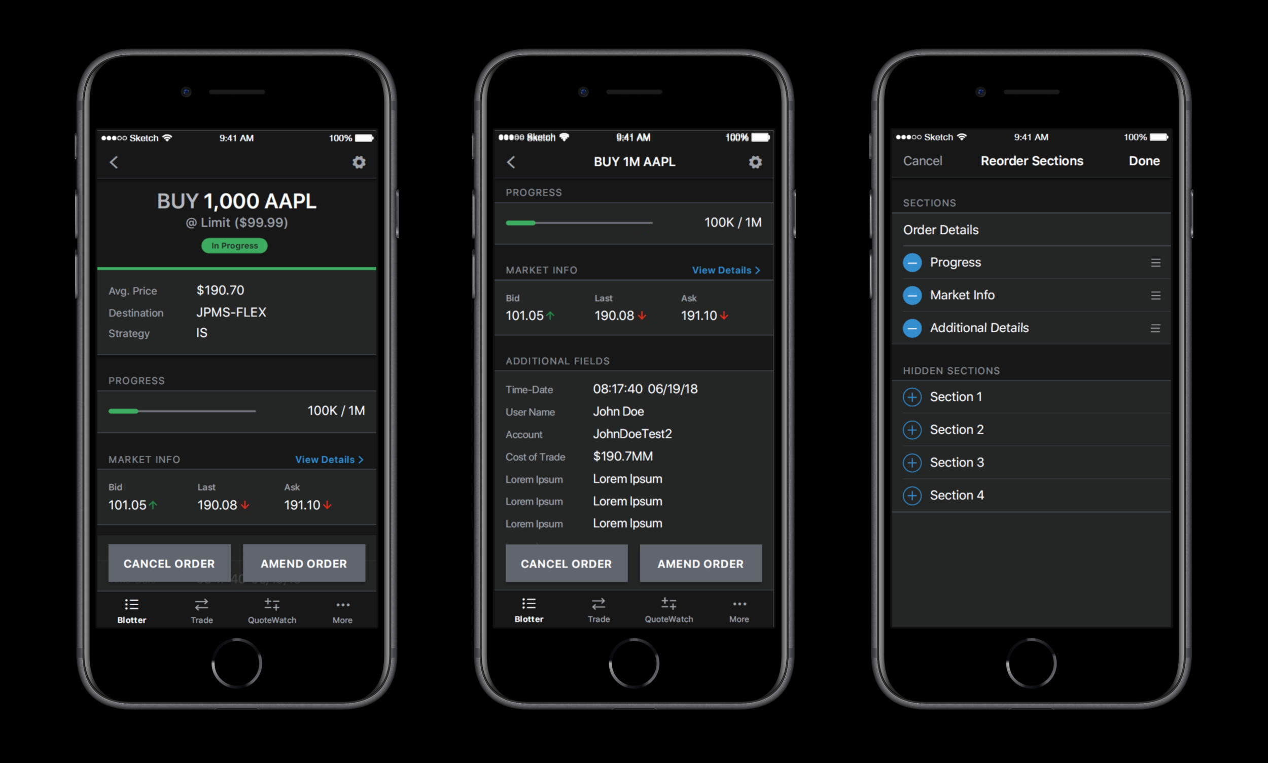
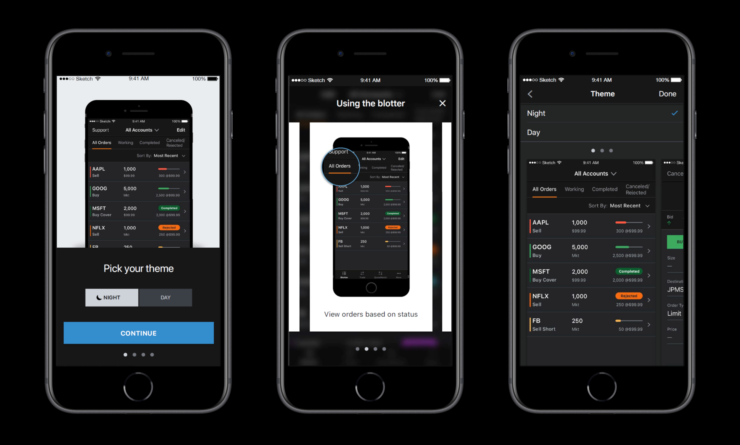
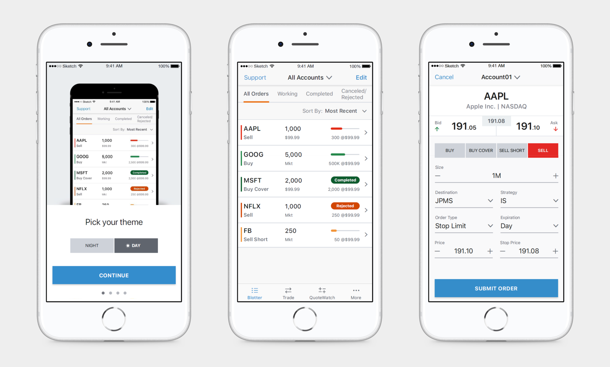
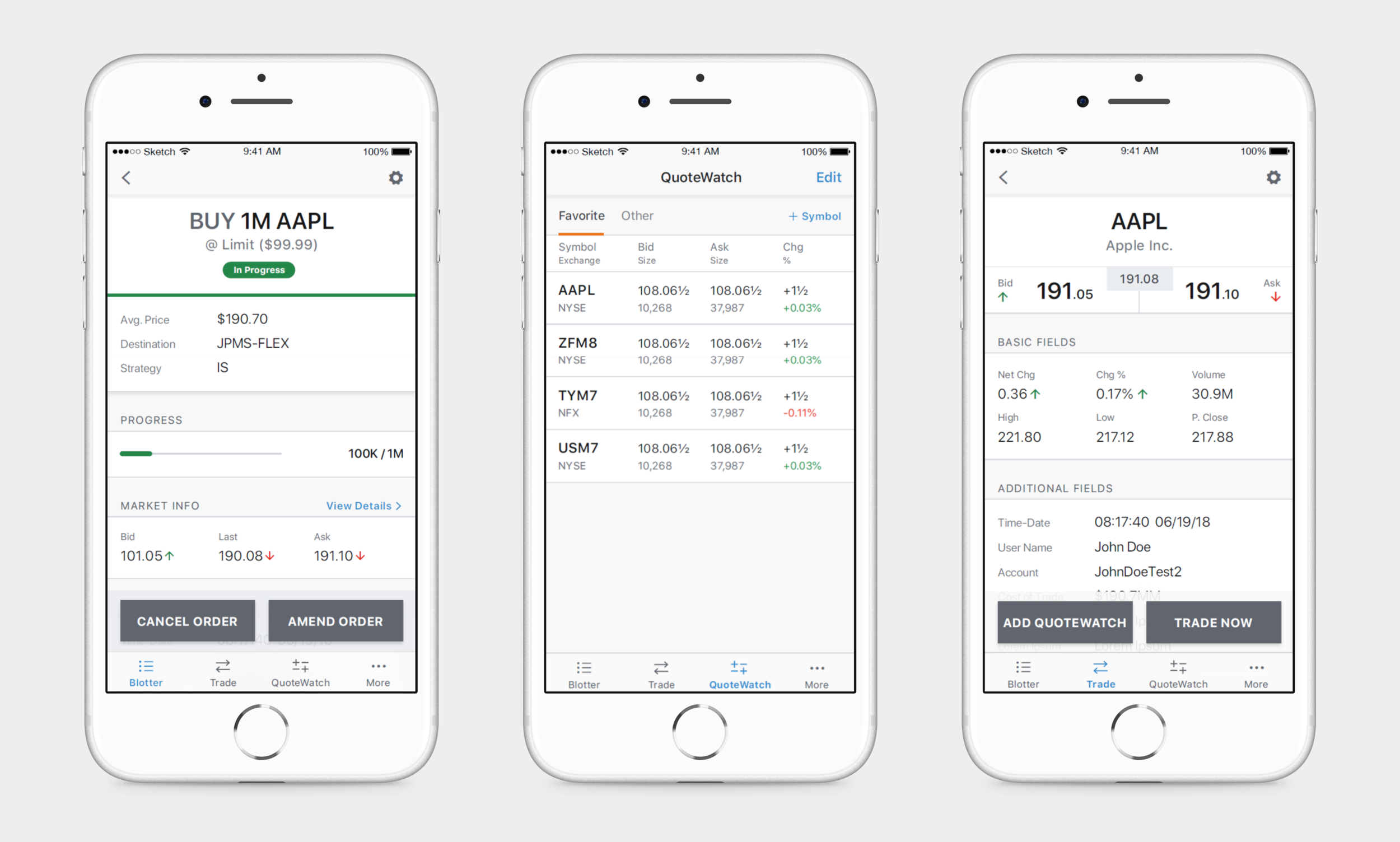
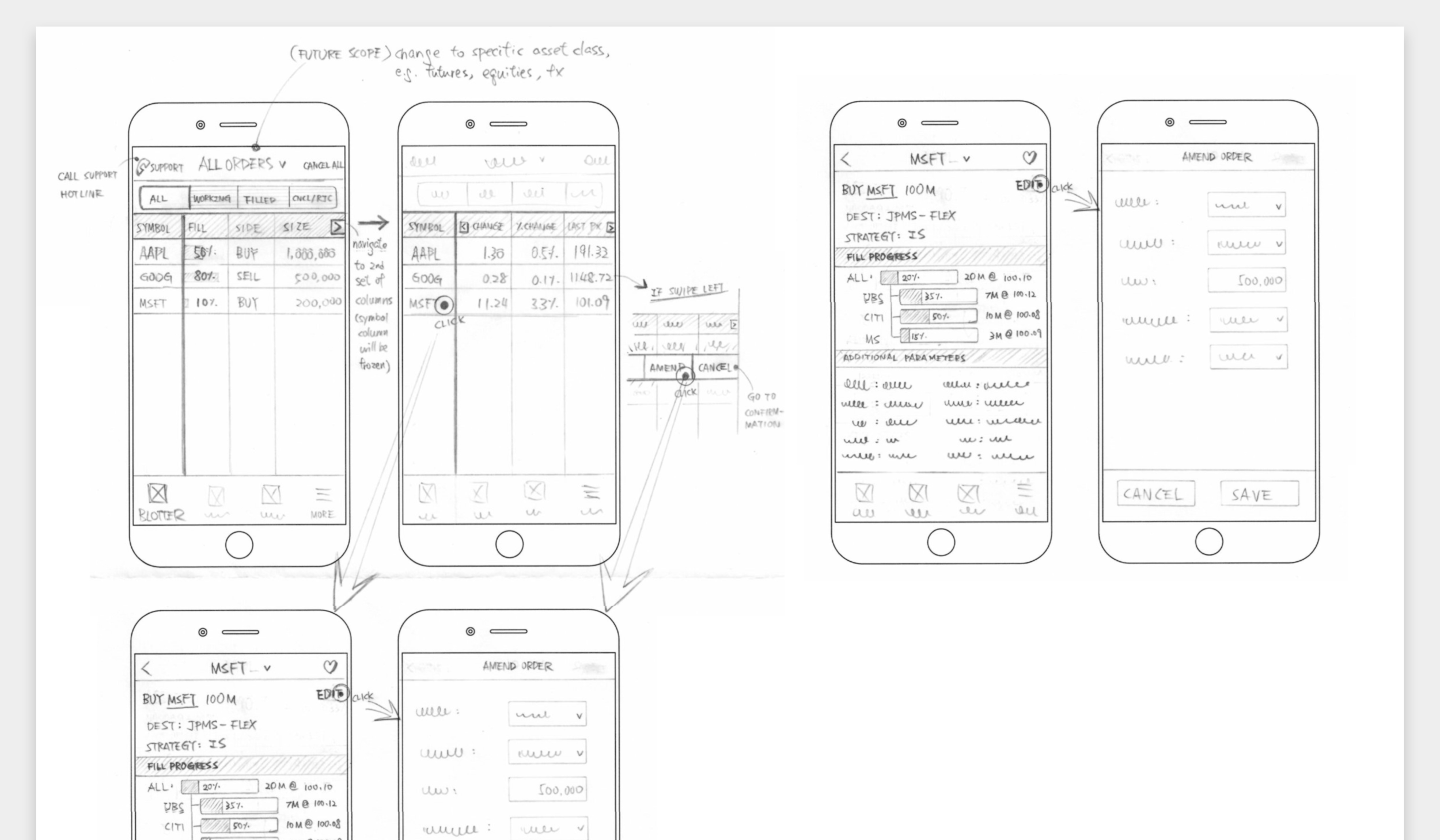
As the mobile trading app was one of the first native iOS apps built with a newly defined Mobile Design System within the team, we utilized those predefined patterns which were aligned with standard iOS mobile patterns for efficiency and familiarity. We then explored any new patterns that were required for our use case - for example, progress bars to indicate where your trade status is as it develops – and focused on standardizing patterns and creating reusable components that can be contributed back into the design system.
In order to reinforce usability and interactivity of the app, we used a mix of iOS conventions and a Material Design inspired interaction model to be intuitive and interesting. We didn’t want to add too many interactive components to the app that can hinder the user’s mindset wanting to quickly execute a trade on the run so we kept it fairly simple and minimal – for example, we applied swipe interaction with a slight lift/left to quick trade a stock from my Watchlist.
Visual & Interaction Design