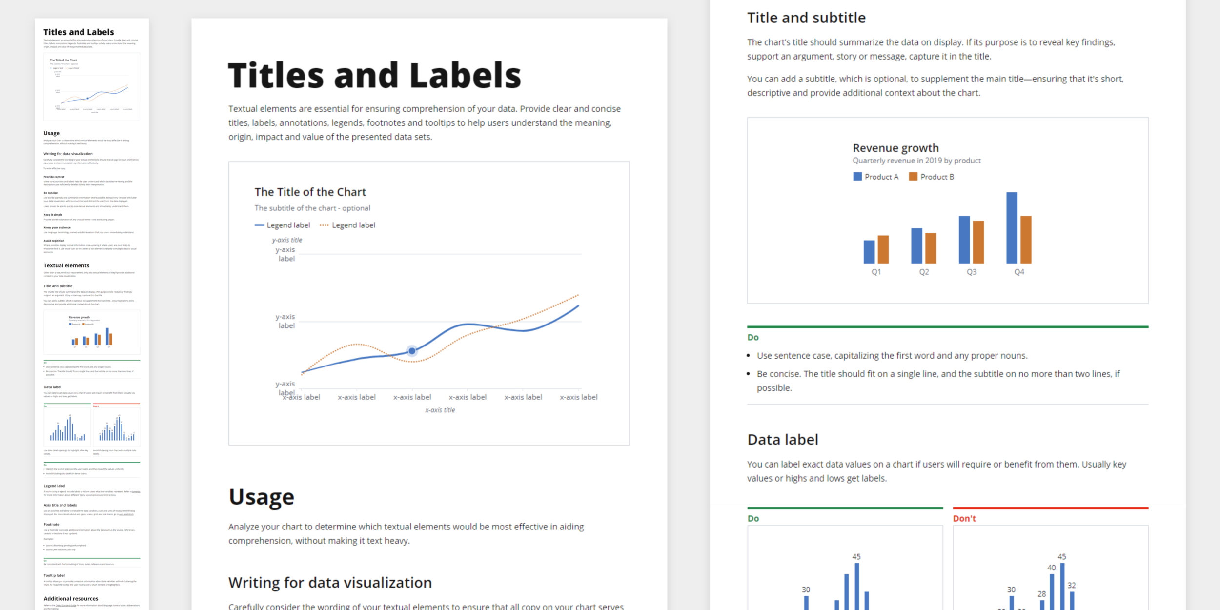
Data Visualization Standards
Data Visualization is an important facet in financial services applications when we are dealing with so many numbers and complex data. It is also one of the most complex, with complicated and detailed requirements in design, accessibility, performance, extensibility, and other dimensions. With so much to sift through, data visualization helps us to extract that complex data and transfer it into a more intuitive, visually compelling and easy to digest format which helps us communicate these analytic insights to the broader organization.
Having had previous experience focusing on analytics and sales metrics apps, I always had a high interest in data visualizations around how to understand and analyze data to choose the right chart type, various types of chartings and tools and the visual guidelines.
At the time, I had 3 different data visualization guides that were handed over to me from various teams to mix and match to incorporate into my projects which was a jarring experience and it immediately kicked me off to work on the Data Visualization standards to create a unified, single set of guide that aligns with our Design System and can be utilized across the team.
The Problem
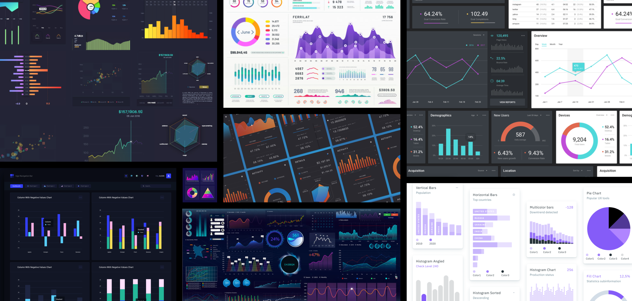
In the past, 3 different teams defined/maintained their own set of data visualization guides not realizing there were actually 3 different guides. Not only the guides were created separately, but the actual charting components and tooling were all developed utilizing various third-party implementations which made it even more complex to figure out whether we should start from scratch or the best way to merge them.
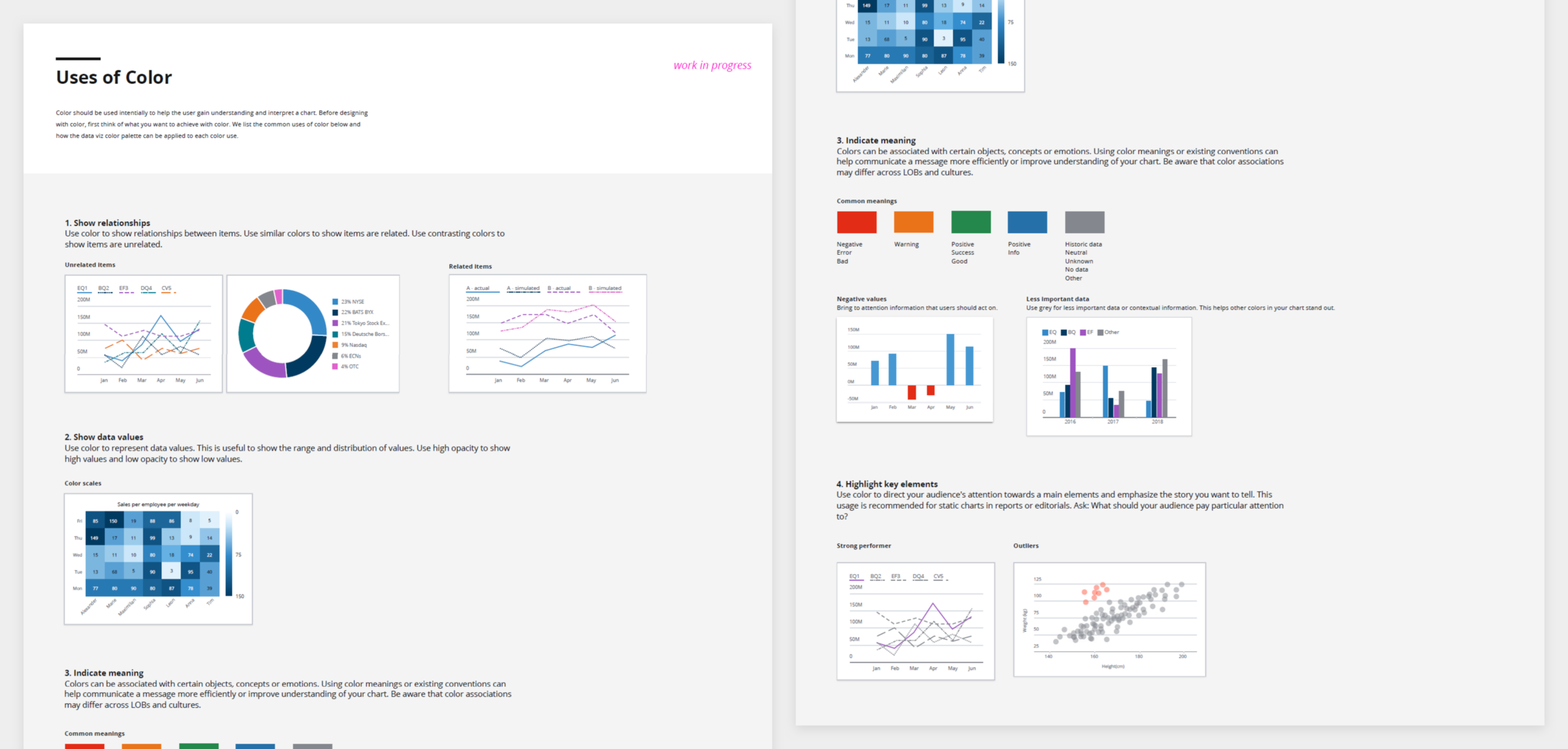
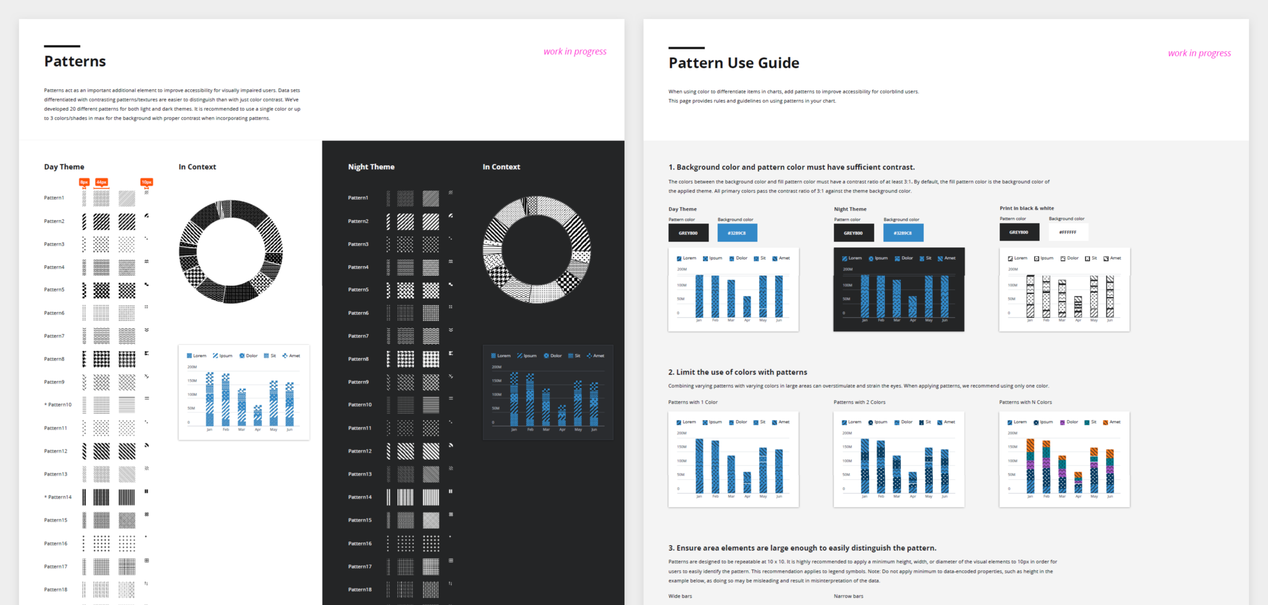
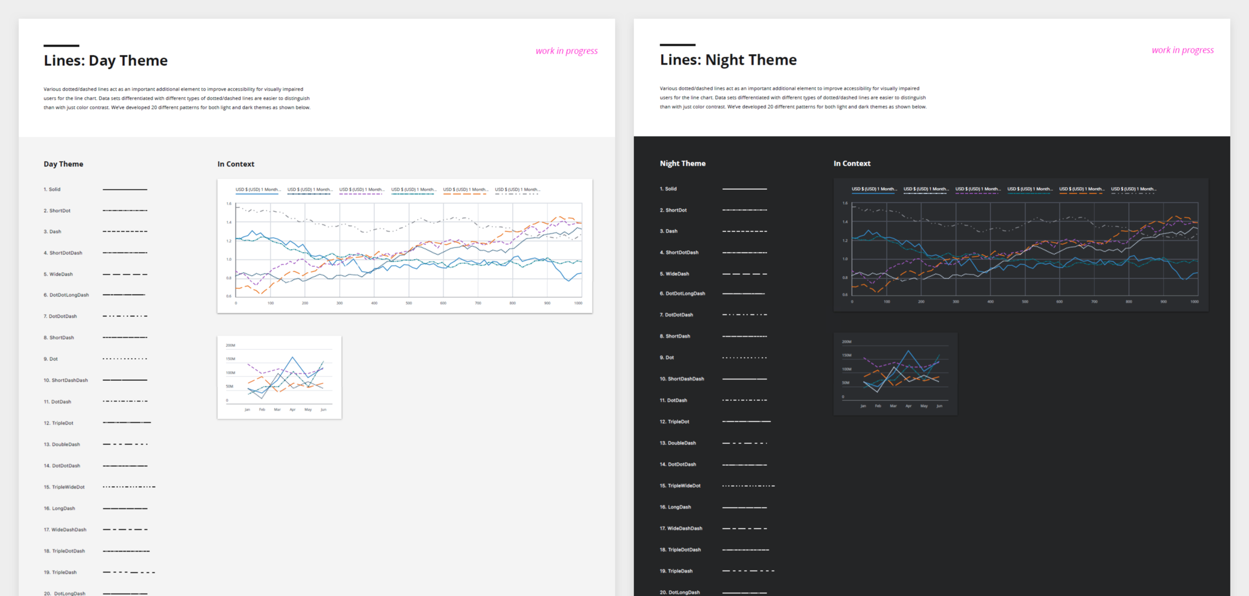
My goal was first to focus on the visual and interaction patterns as well as promoting full accessibility to ensure that functionality is aligned and integrated with the rest of our Design System in order to provide a consistent experience to our staff and clients.
User & Audience
Our users are designers, developers and product managers seeking to integrate charts into their products need not only a set of well-designed, performant and accessible componentry, but also a manageable process for acquiring licenses, staying up to date with evolving feature sets, and clarity around how to navigate the set of componentry that we endorse in the Design System.
Team & Role
I kicked off the project and led setting the first set of standards for the data visualization practices within our organization. In the beginning, this project started as a side project for myself without other partners so my first focus was to assess existing guides, see what can be merged into a single set, and defining visual direction and interaction patterns to align them to our Design System language so they can be folded into the system in the future.
After I defined the visual direction, the team was structured officially to support this initiative. Then I partnered up with a UX designer, product manager, content strategist and 3 developers to enhance our visual components and patterns, prioritize roadmap to tackle and to measure our goal and collaborate together.
Discovery
During the initial discovery phase, I led the full cycle of the project from user research to information gathering to workshop sessions with few designers, product managers and developers so I can receive end-user input and ideas. I used both group surveys to quickly get user inputs and also facilitated few focus groups with curated questions to streamline the time and effort. As I was leading this initiative alone in the beginning, there were lots of manual information gathering and walk ups to teammates to quickly get answers around their products and its use cases.
At the workshop session, we identified the key specs that led us to define visual directions, then mapped out the ideal user flows and requirements that allowed users to identify what chart types based on data types utilizing the resources and best practices available on the web in general. I found the participatory design process to be extremely effective as we had all of the team members participate in the design sprint workshop whiteboarding, sketching and ideating collaboratively.

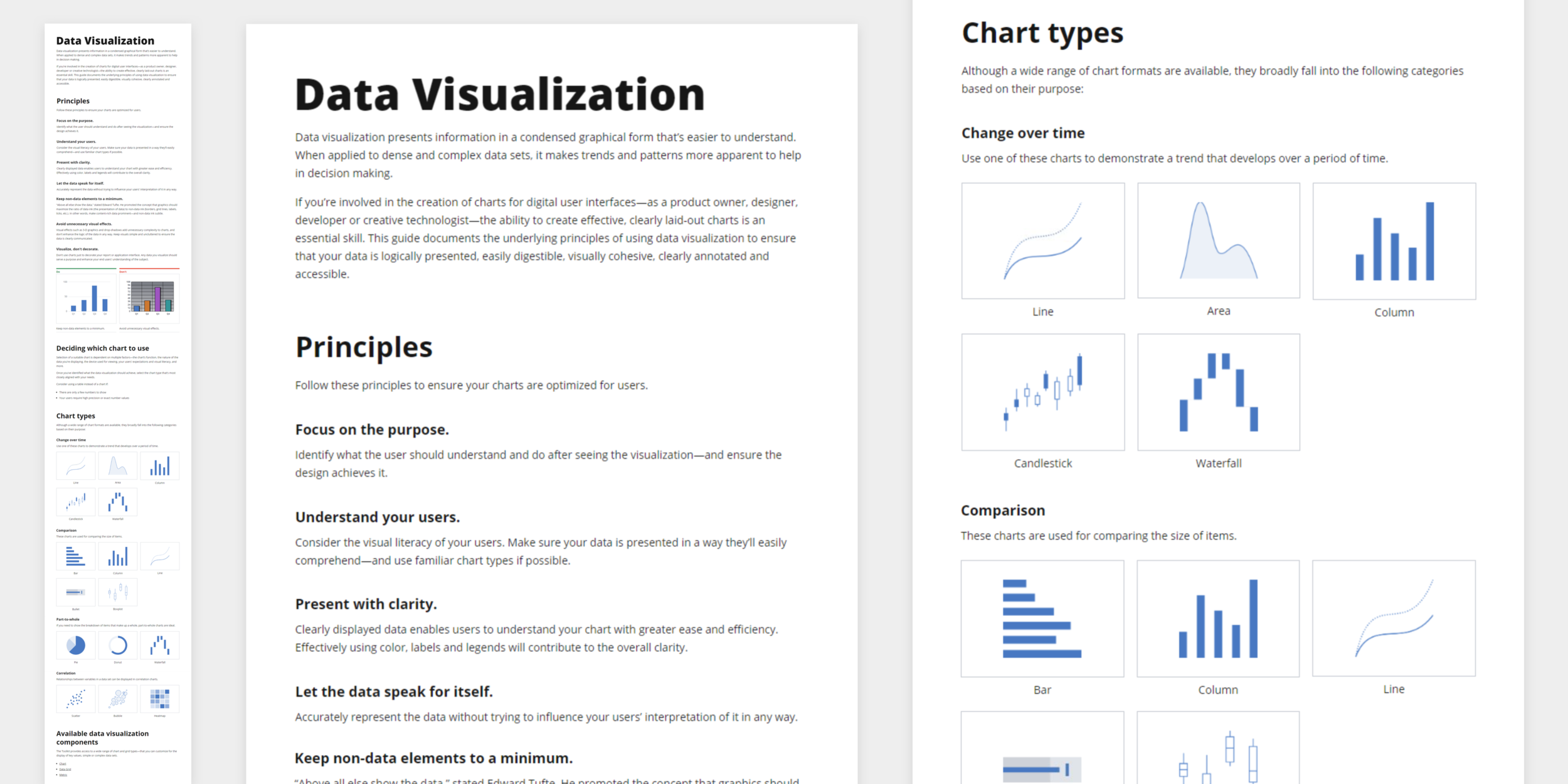
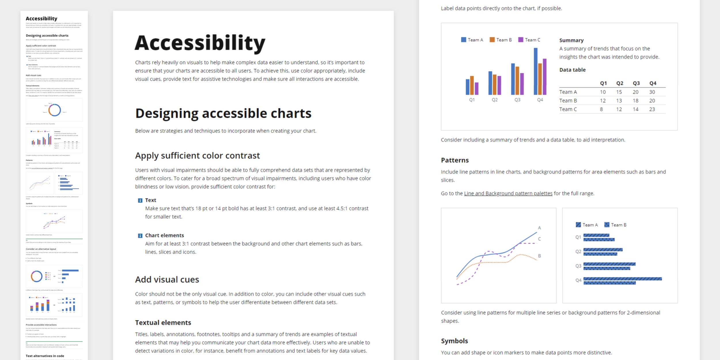
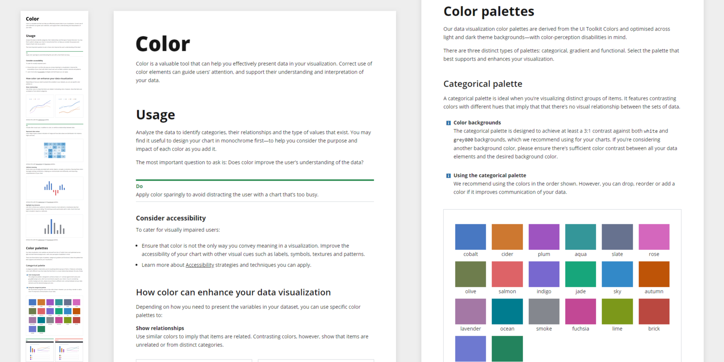
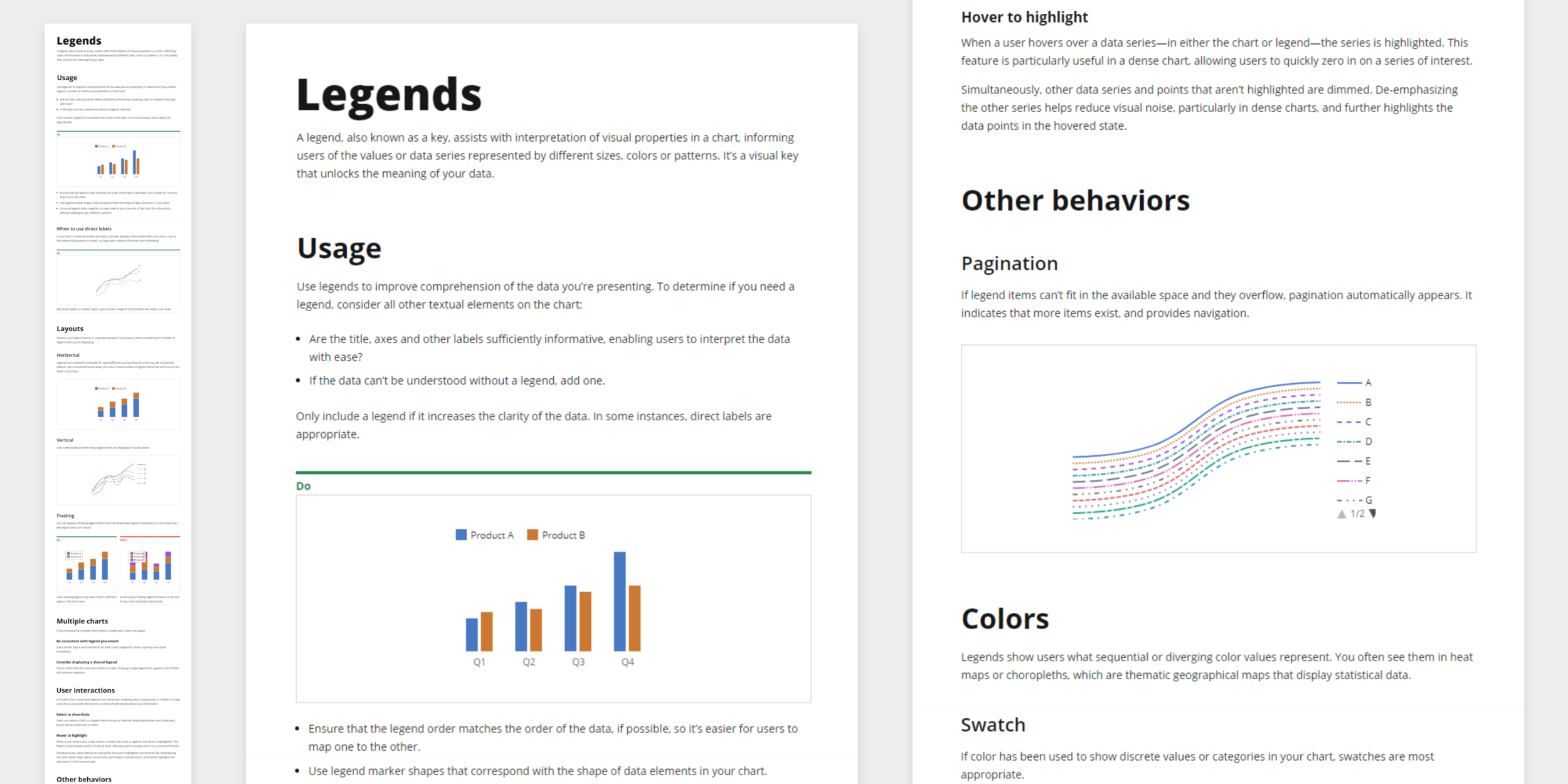
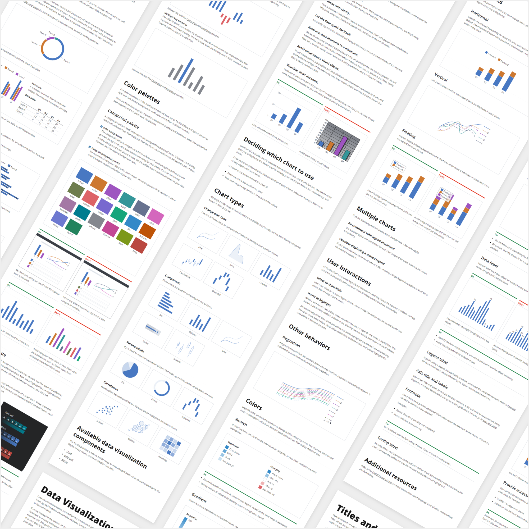
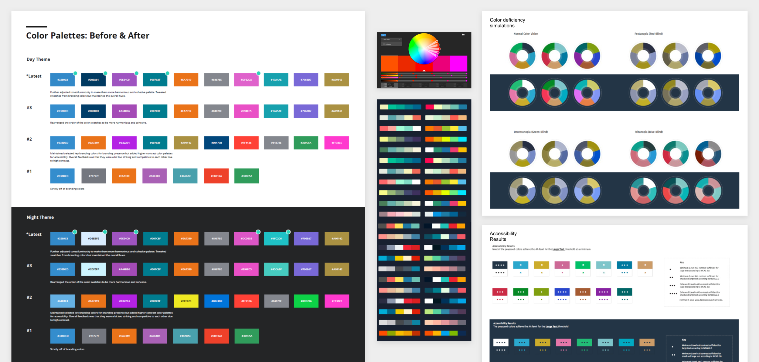
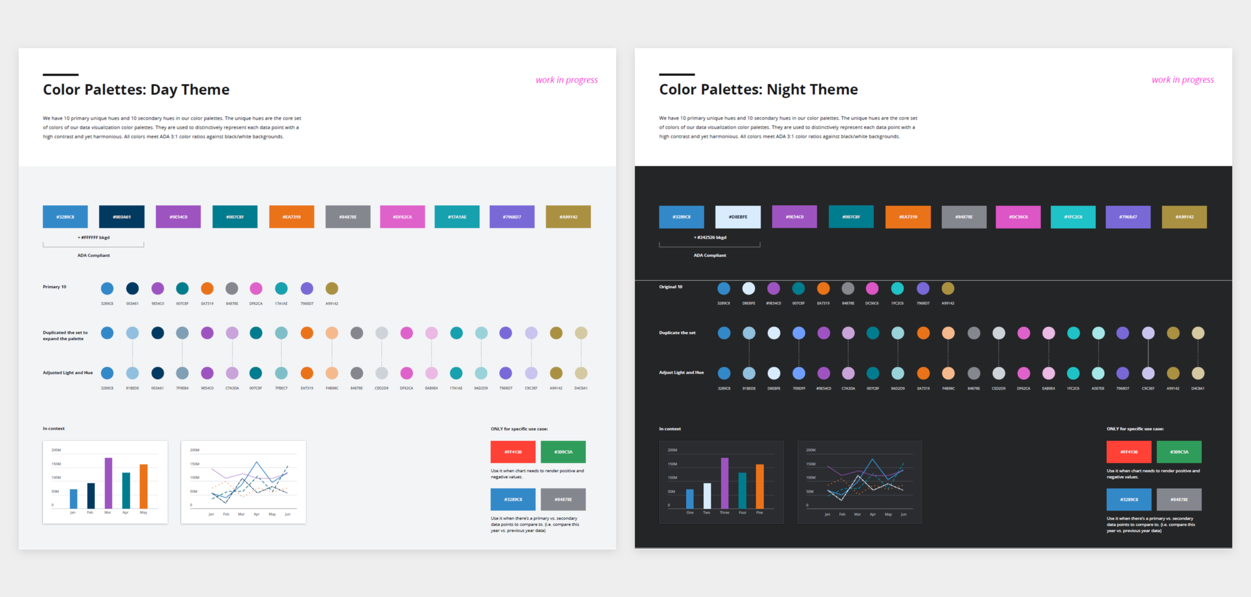
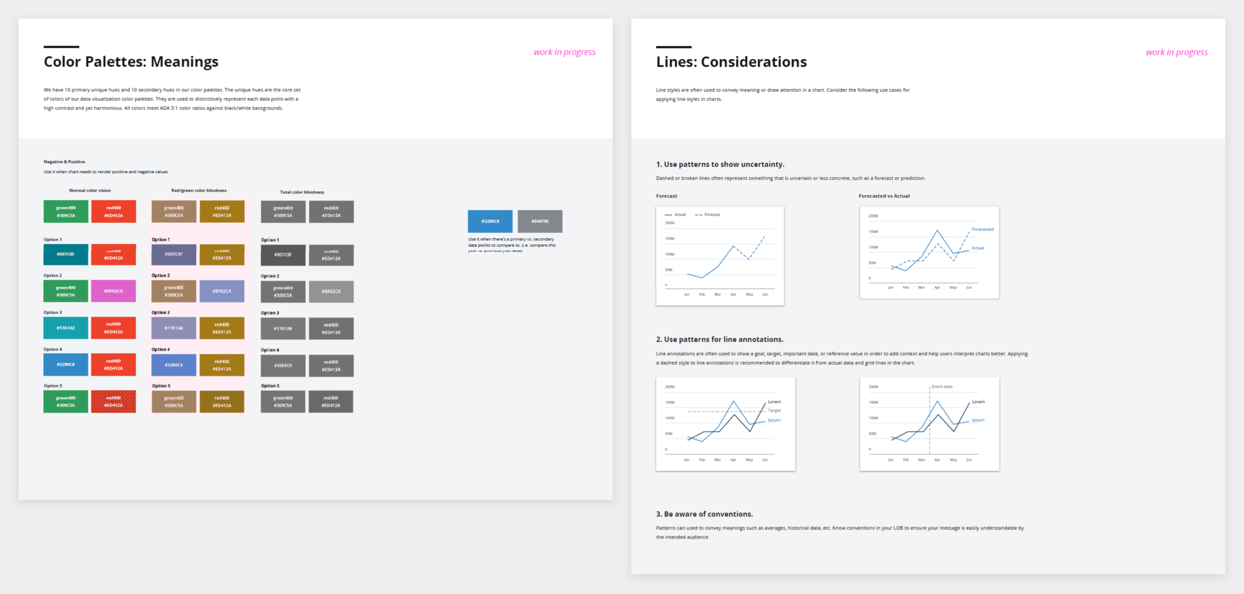
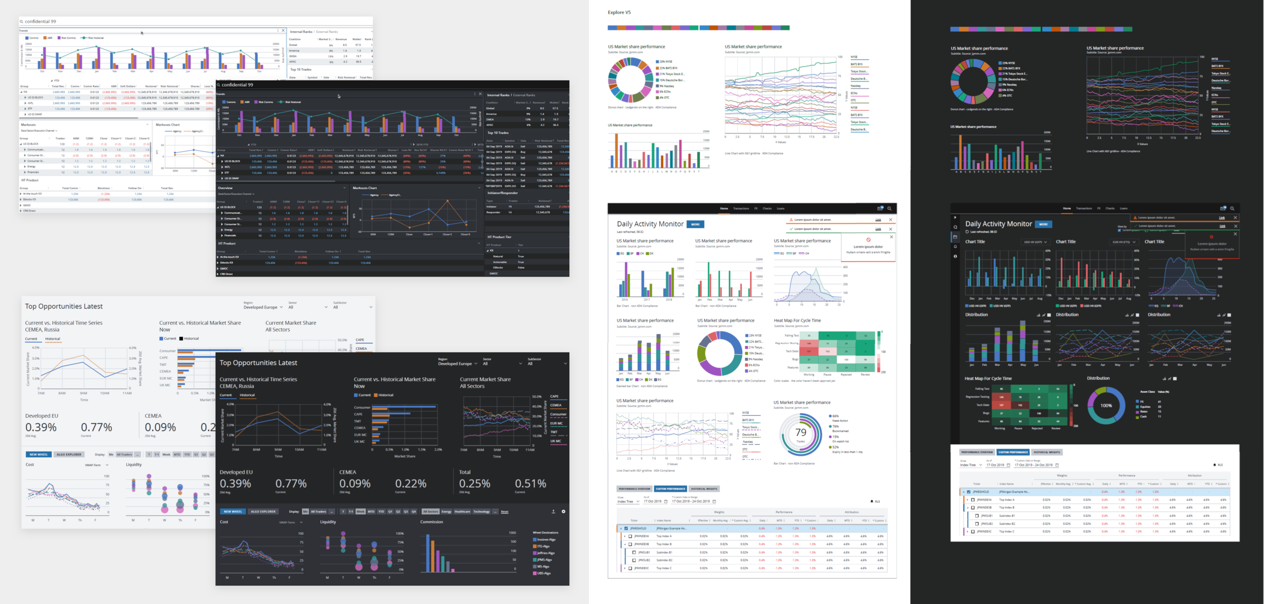
I then took all the findings, ideations of whiteboarding and sketching and incorporated them into setting the first set of standards. During this process, I focused on mapping and laying out various types of charts to extend our library to fully support various use cases and comparisons. Then I reassessed 3 existing data visualization guides against our Design System patterns and worked on more cohesive, unified visual treatments. I also spent a lot of time exploring various sets of colors and patterns to provide a robust set of options to be visually appealing but also ADA compliant.
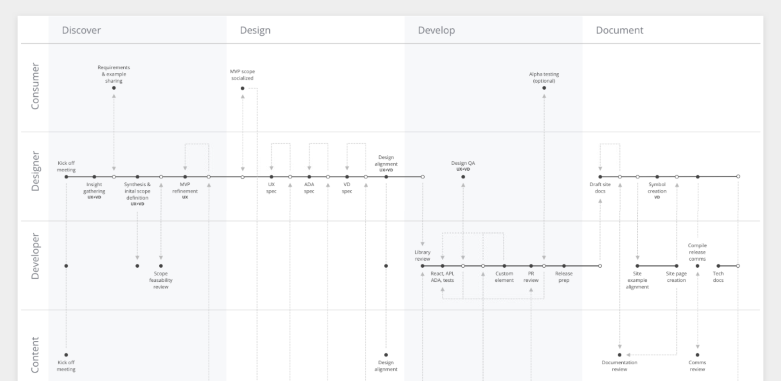
Develop, Deliver & Iterate
As part of the process, I constantly tried incorporating these designs into the actual products to test and to ensure the defined UI and interactive patterns actually work seamlessly with existing products. It was a great exercise not only to validate the outcome on my end but to showcase them to our users and get their feedback earlier on the stage.
When the official team was structured and got funded, we were able to map out the roadmap, prioritize our deliverables and extend the standards to be more structured and aligned with the Design System incorporating the defined language patterns and content directions.
Outcome
After numerous design, develop, test, and iterate processes, we successfully released the Data Visualization standards via the Design System as a final release. We received a lot of positive feedback especially on the note how much it is helpful to have a full suite of chart type libraries and guidance around its use cases and do’s/don’ts. Also our effort on exploring various colors and patterns to define a unique and robust set and yet aligned with the rest of the Design System colors satisfied and solved many of our users’ problems which enabled them to create visually attractive data visualization that is fully accessible for all users.